Project type:
Event Branding, Advertising, Video Editing, Billboard design, print
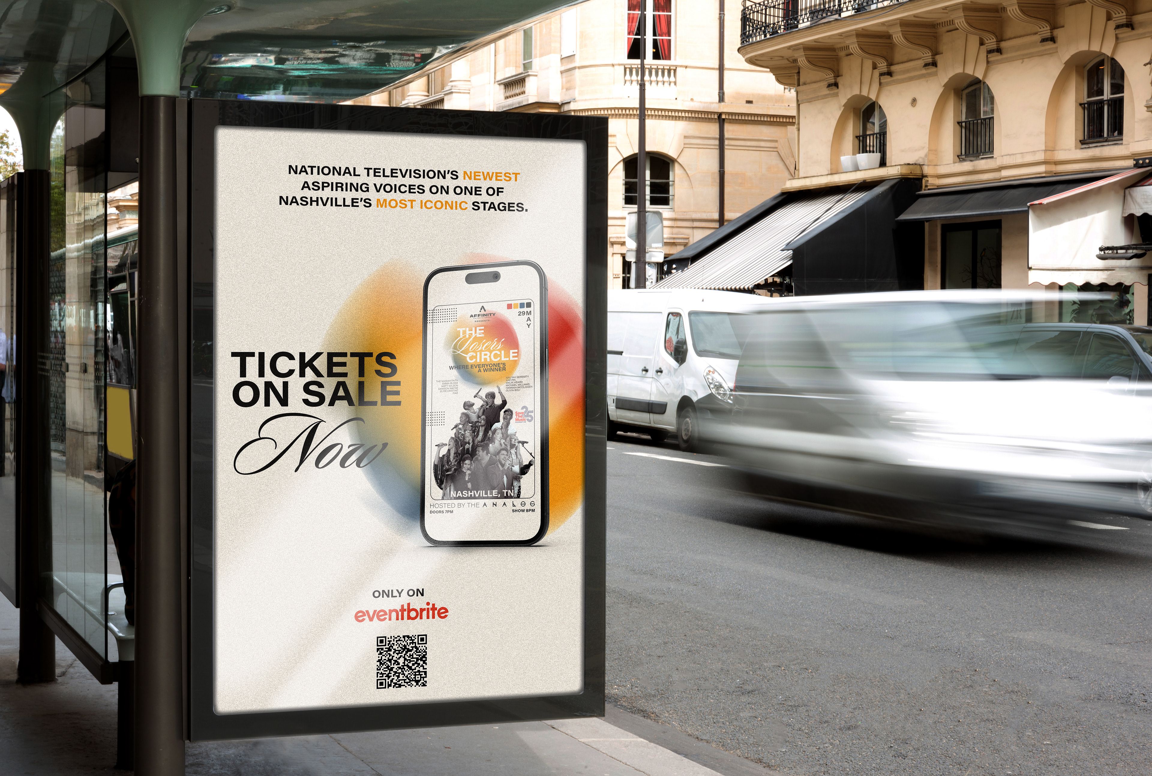
The Losers Circle was an electrifying live show and live stream event at the iconic Analog Theater in Nashville, showcasing 12 top American Idol Season 21 finalists. With an impressive audience of over 500, this unforgettable show brought together an array of talent and music enthusiasts.
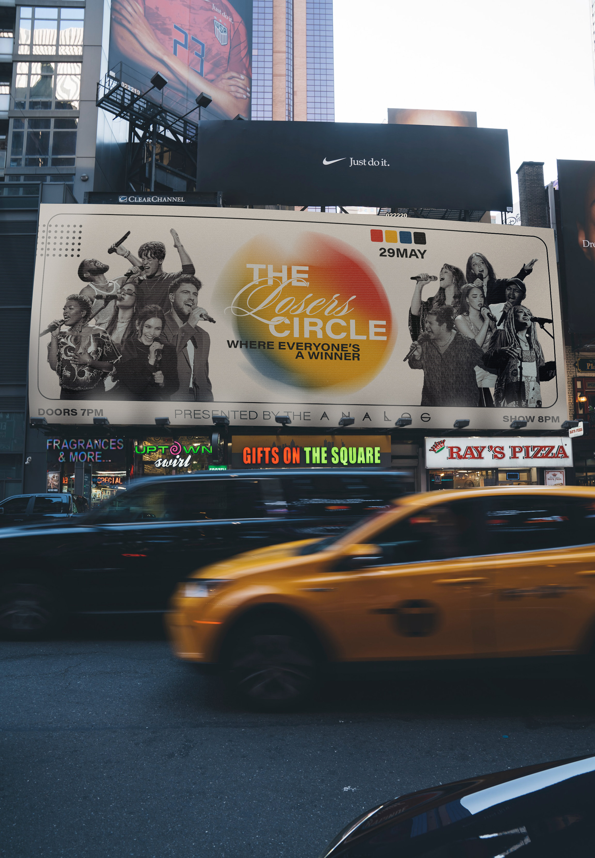
As the creator and designer behind The Losers Circle, I took on the responsibility of crafting a captivating visual identity to effectively market the event. This encompassed a wide range of materials, including digital advertising, print media, out-of-home billboards, and video marketing. The primary challenge I faced was to strike the perfect balance between a visually appealing brand and an authentic representation of the performers' energy.
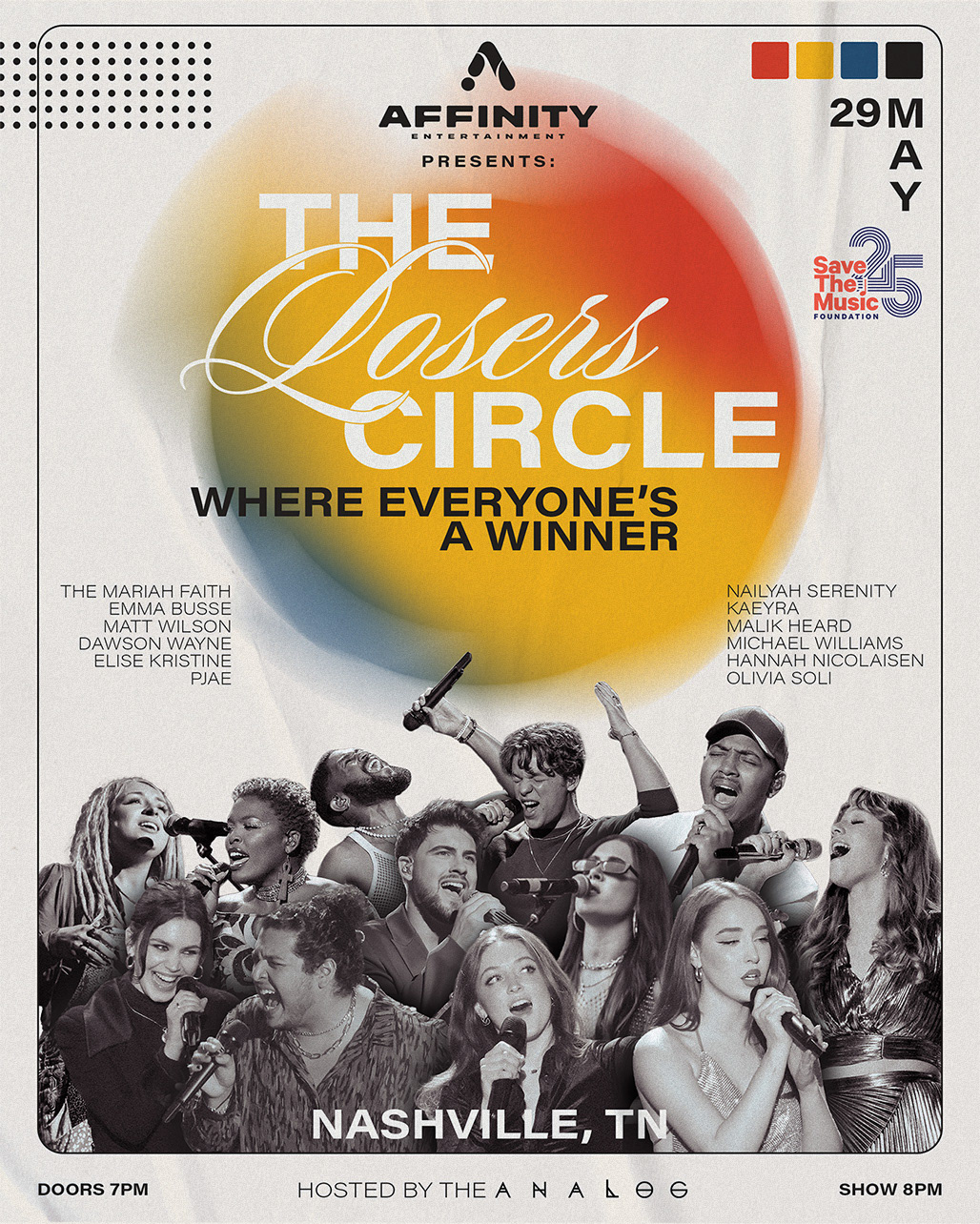
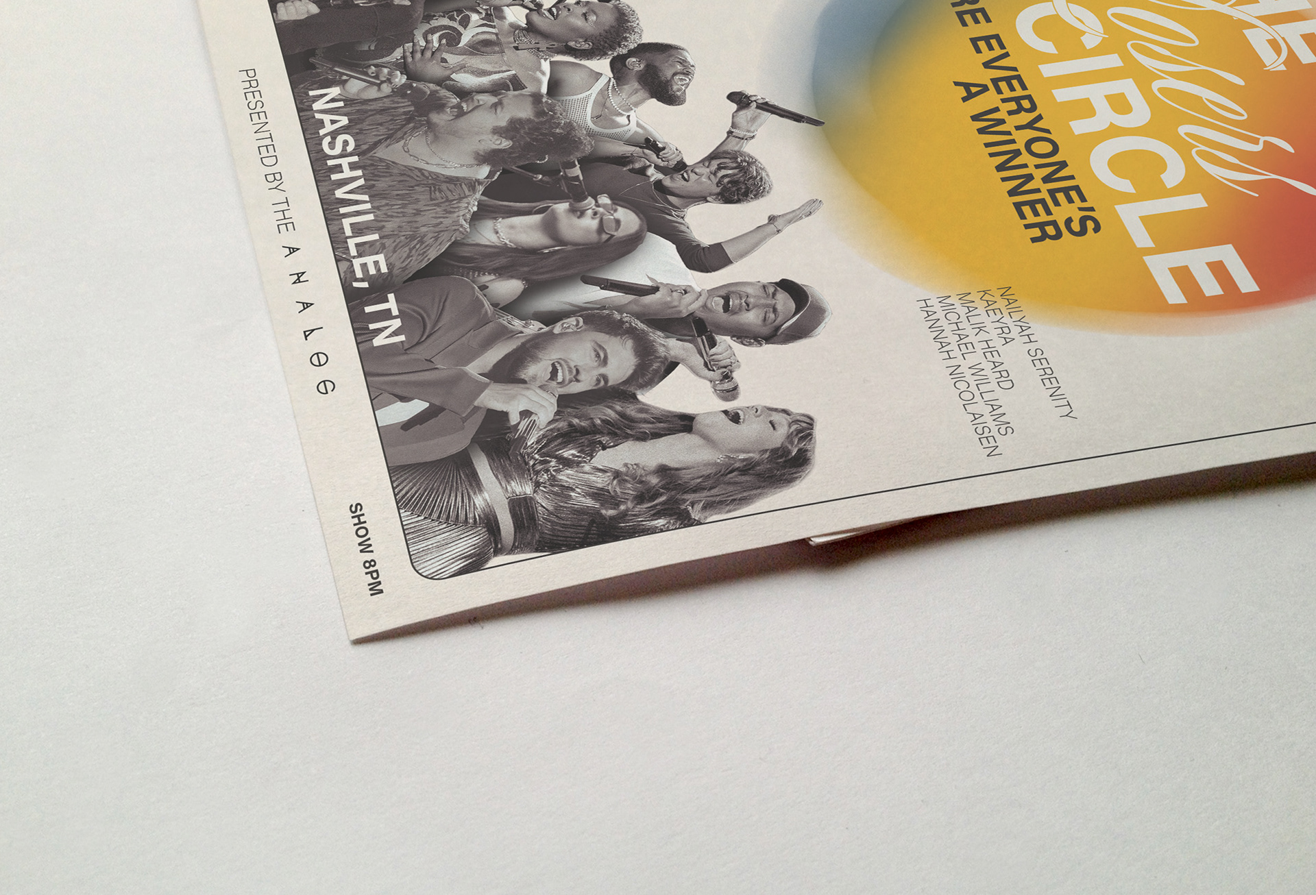
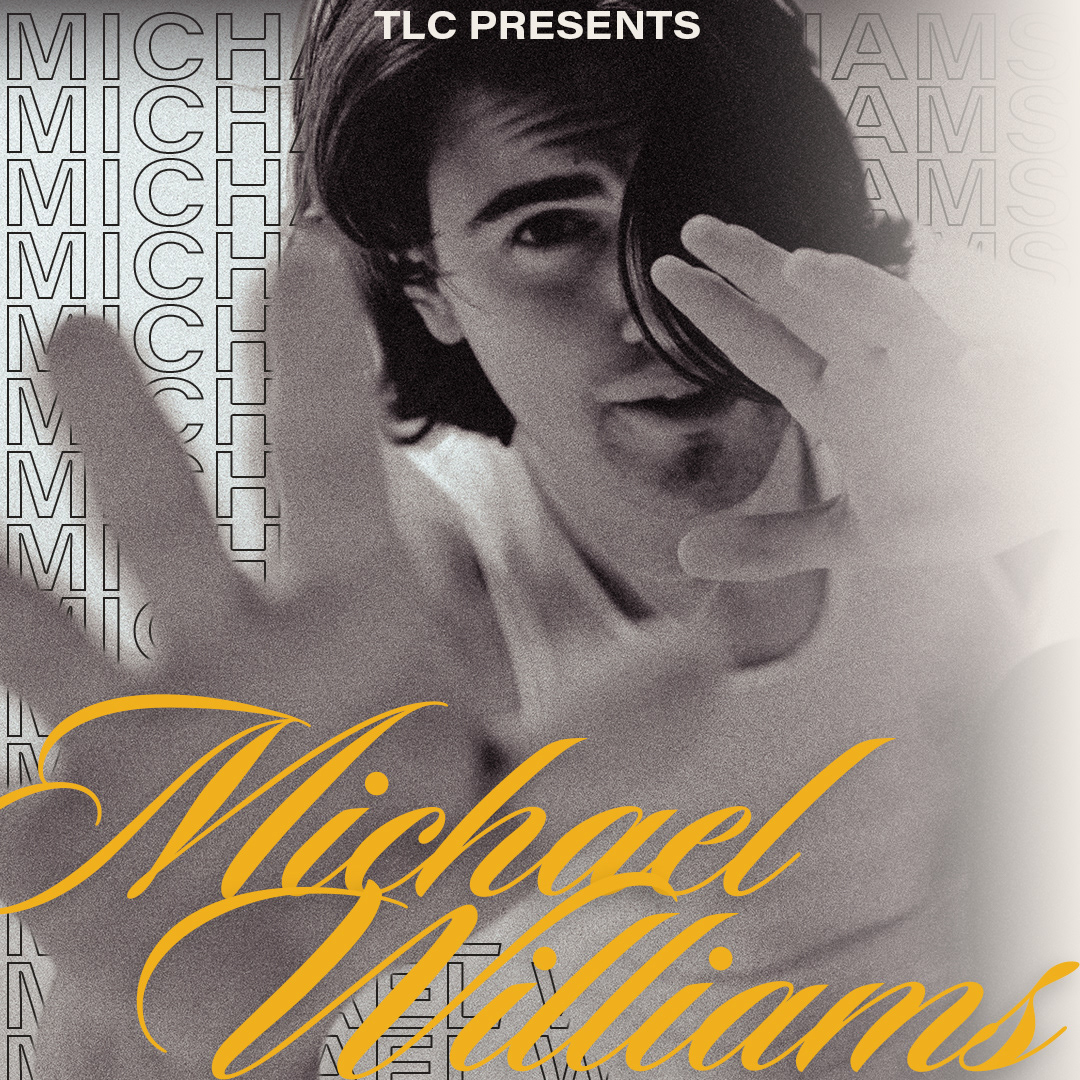
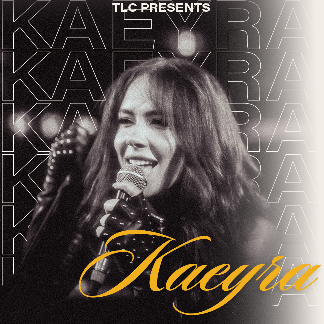
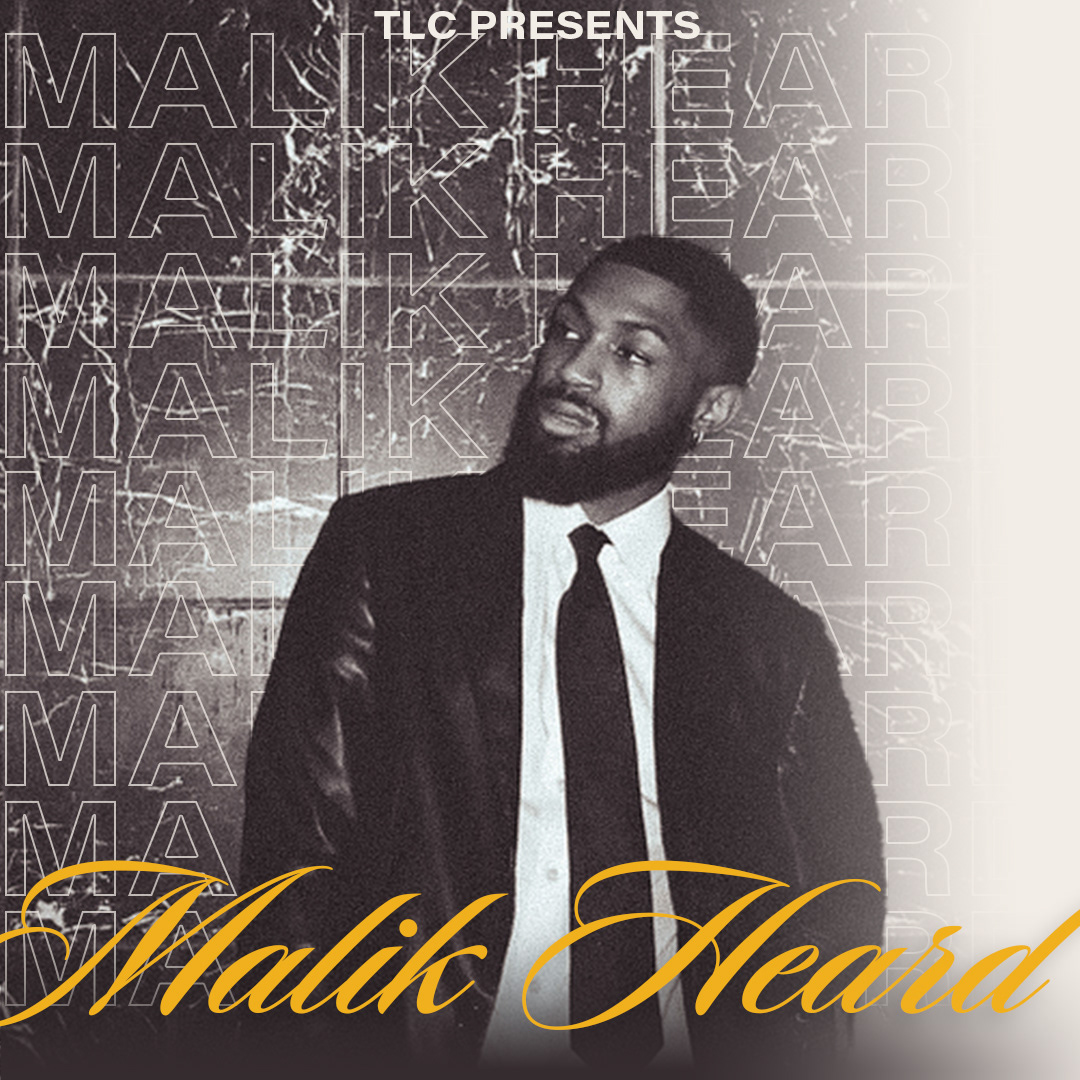
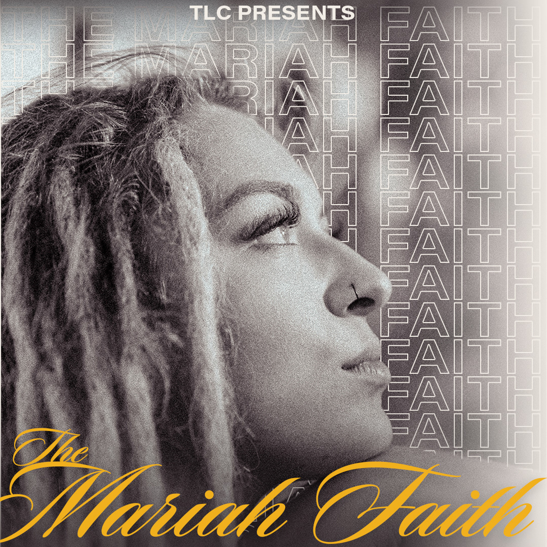
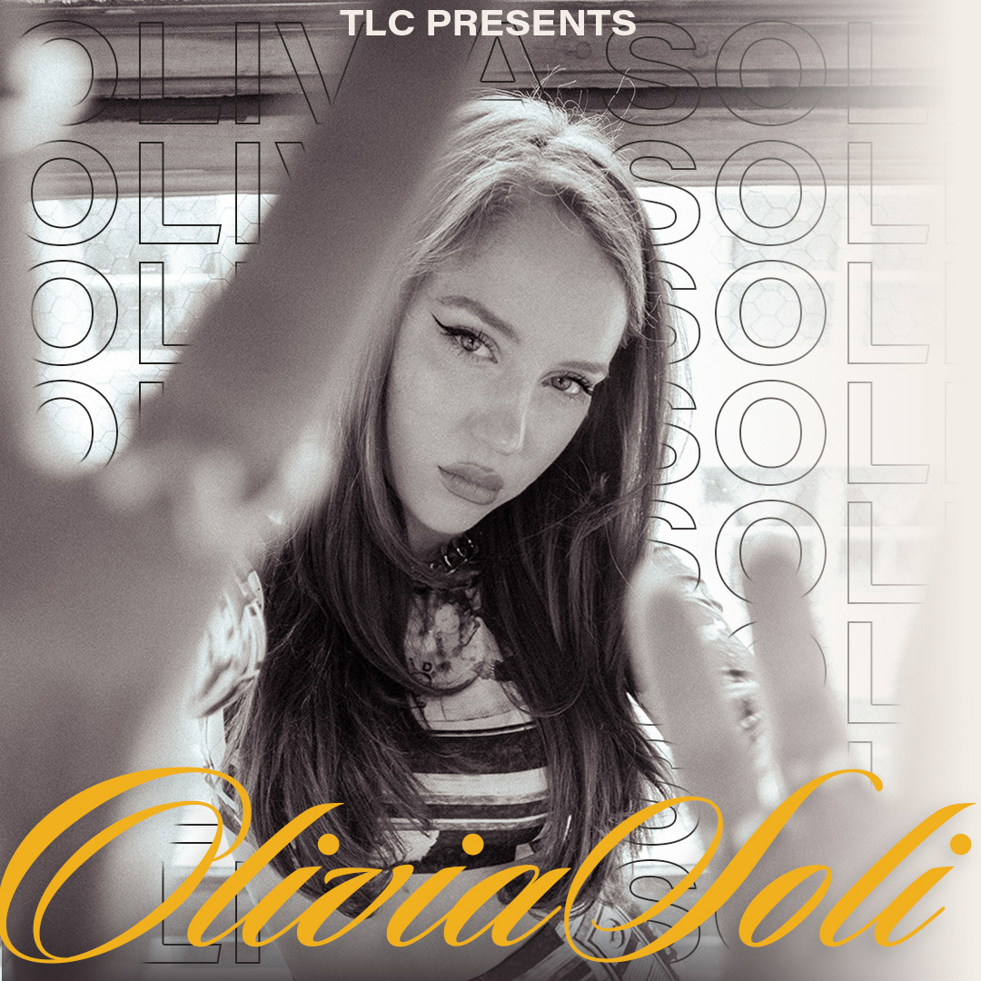
To conquer this challenge, I decided to utilize performer action headshots as the focal point of the visual materials. By showcasing the artists in the midst of their dynamic performances, I aimed to capture the essence of their passion and talent. This approach allowed the performers' vibrant energy to shine through, becoming the driving force behind the overall branding. The primary color pallet provides a recognizable and almost nostalgic feeling further promoting the importance of the performers and their skills.
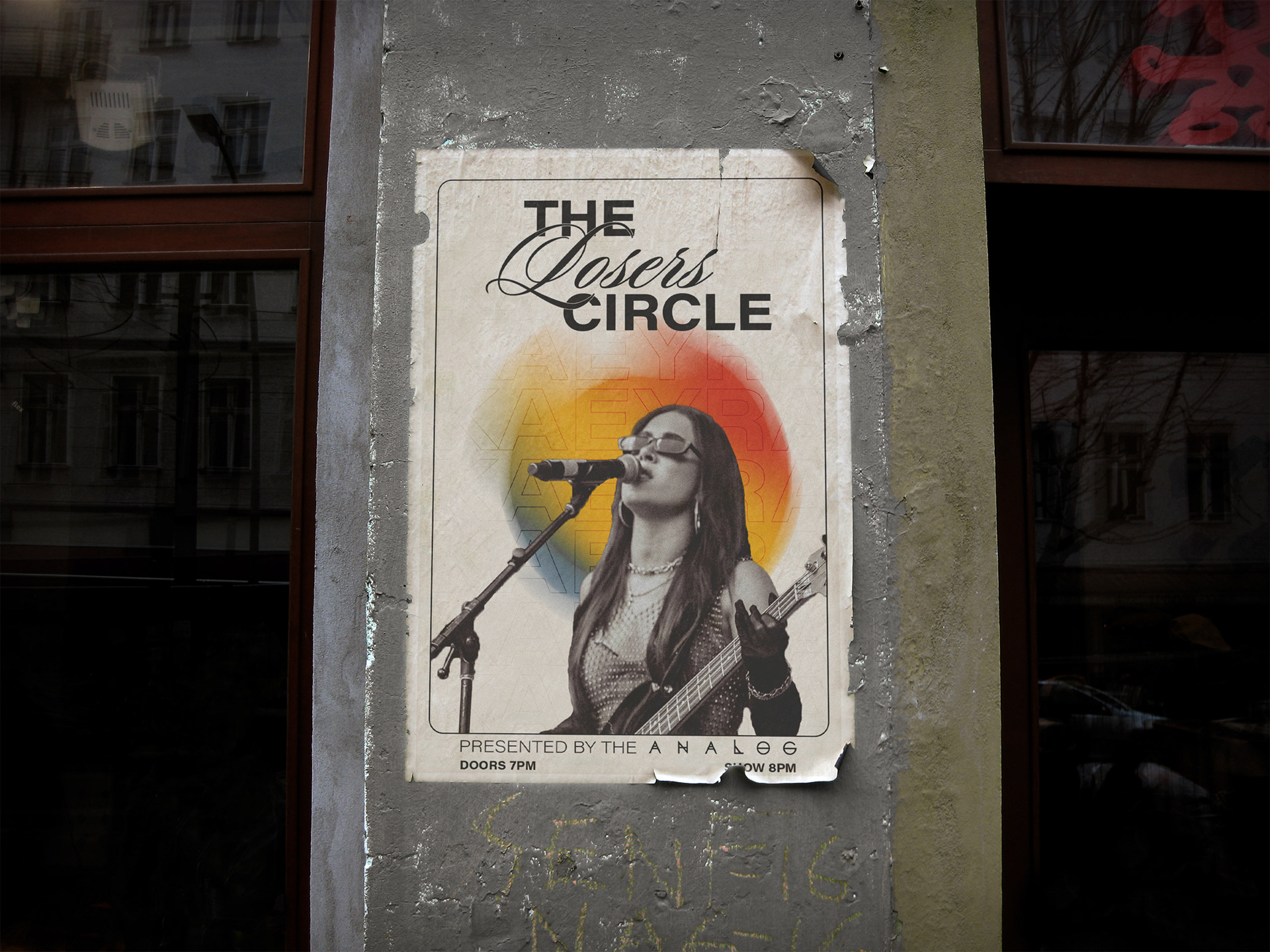
Now, let me clarify something: the performers were anything but losers. They were incredibly talented and deserving of recognition. However, the intention behind the name was to create a sense of intrigue and slight sarcasm. I wanted to make people do a double take and question the name, which would, in turn, pique their curiosity about the event and also stay safe from any copyright claims from American Idol.
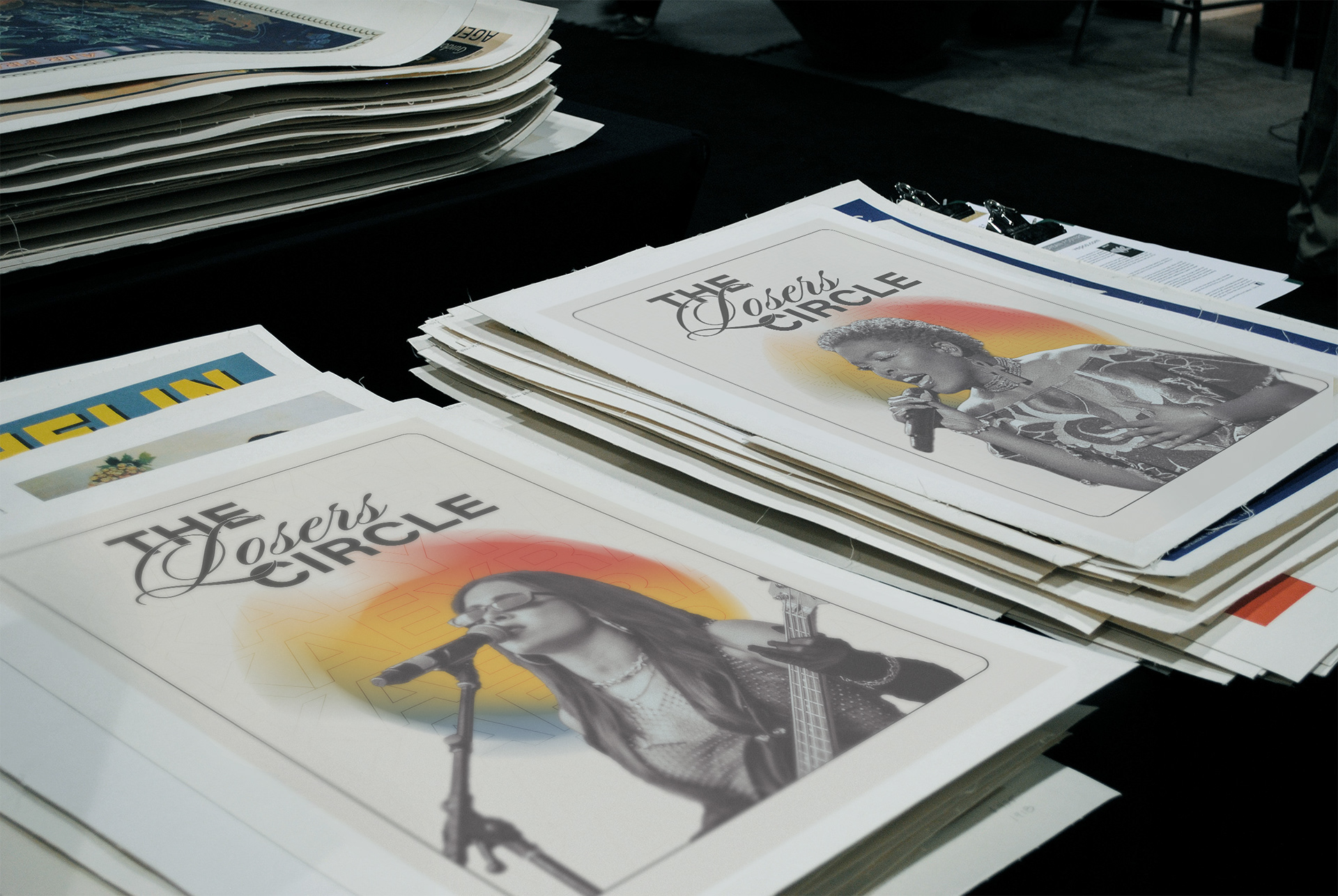
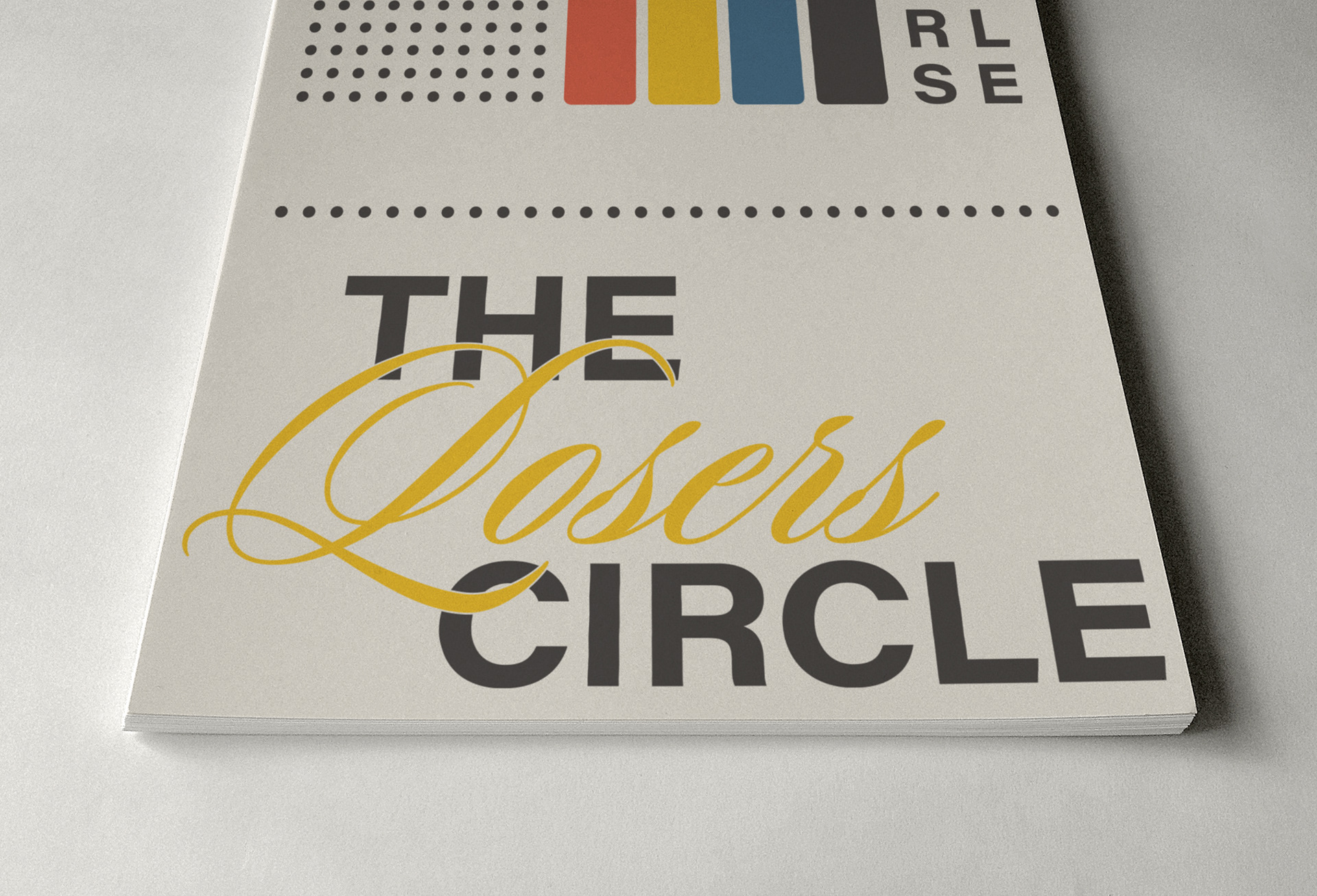
To amplify this effect, I carefully considered the typography choices. I opted for an elegant script font intertwined with a bold sans-serif font. This combination immediately draws the viewer's eye, highlighting the contrast and capturing their attention. The interplay between these fonts adds an element of sophistication and visual interest to the overall branding, further reinforcing the intriguing nature of the event's name.
By choosing "The Losers Circle" as the name and employing distinctive typography, I aimed to create a memorable and captivating brand identity that would leave a lasting impression on the audience.
In order to unite the diverse range of contestants and create a cohesive visual experience, I employed a striking black-and-white aesthetic. By being intentional with color usage, this design choice emphasized the collective mission of the performers, highlighting their shared dedication to their craft. The use of black and white imagery served as a unifying thread, connecting each artist's unique journey within The Losers Circle.

The visual materials I created for The Losers Circle were carefully curated to evoke a sense of anticipation, excitement, and authenticity. By combining the power of performer action headshots with a black-and-white visual aesthetic, I sought to deliver a visually striking brand that resonated with the target audience. The result was an immersive experience that celebrated the raw talent and unwavering dedication of the contestants from American Idol Season 21, elevating The Losers Circle to a must-attend event for music lovers and industry professionals alike.