Project Type:
Re-Branding, Packaging, print, iconography, illustration
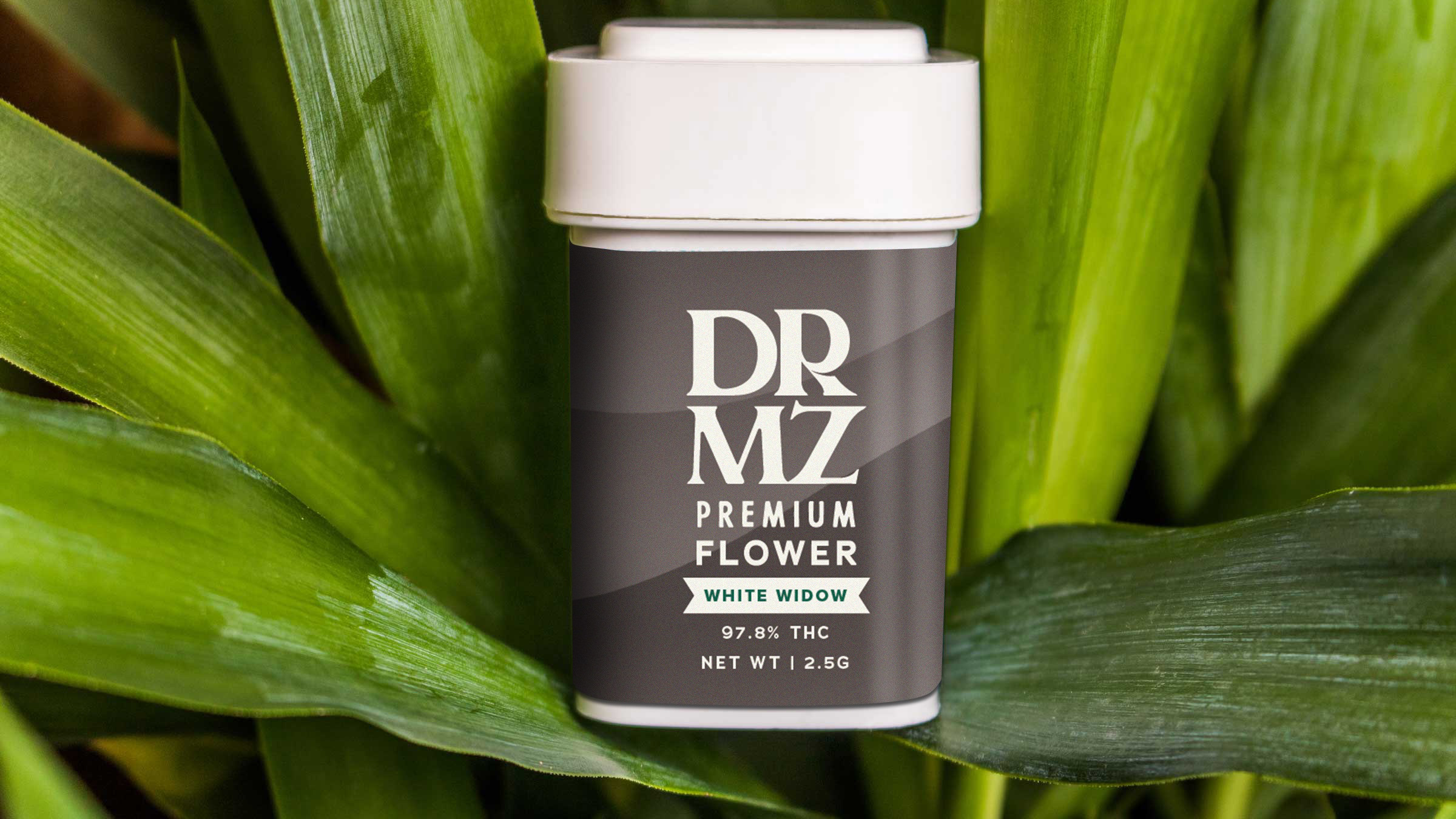
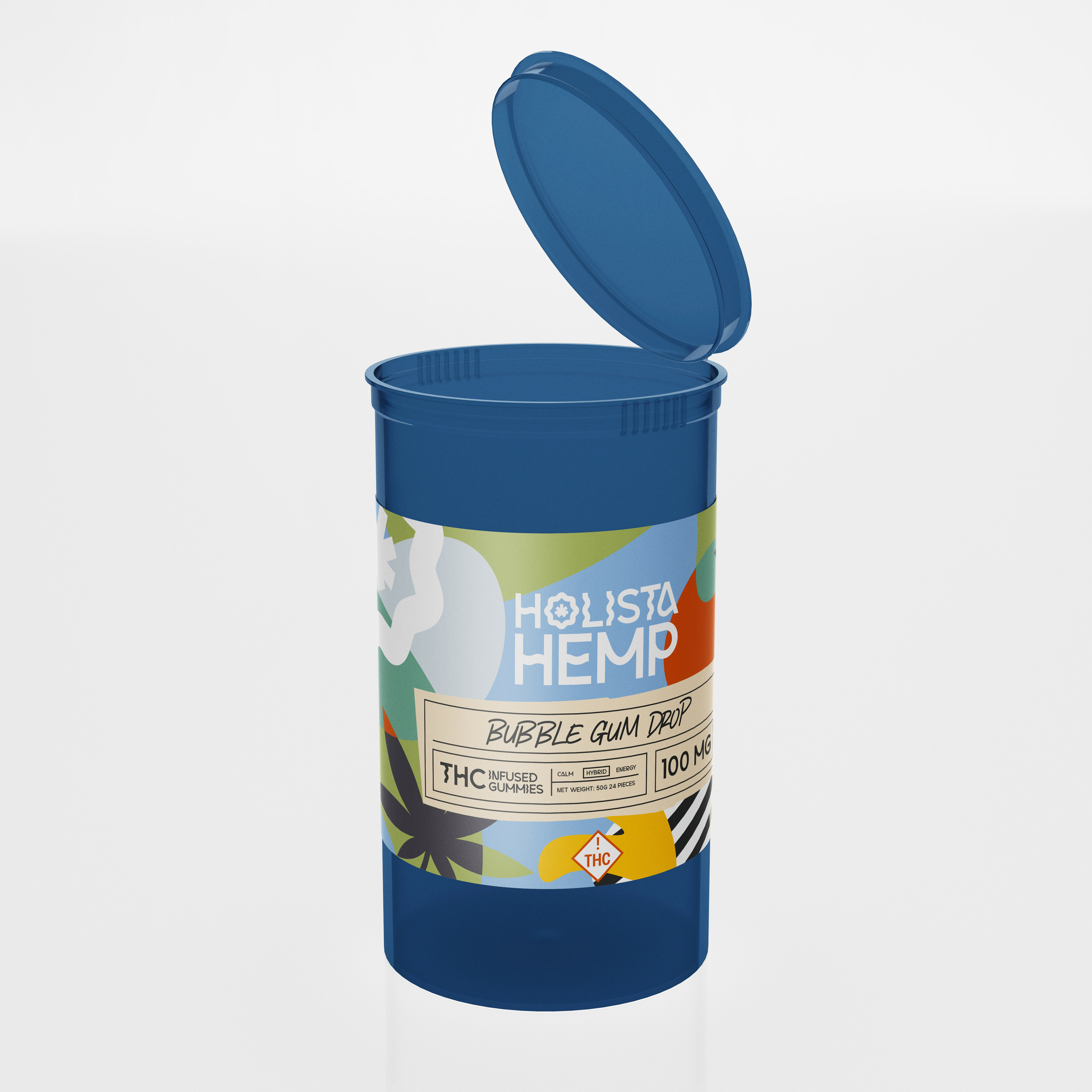
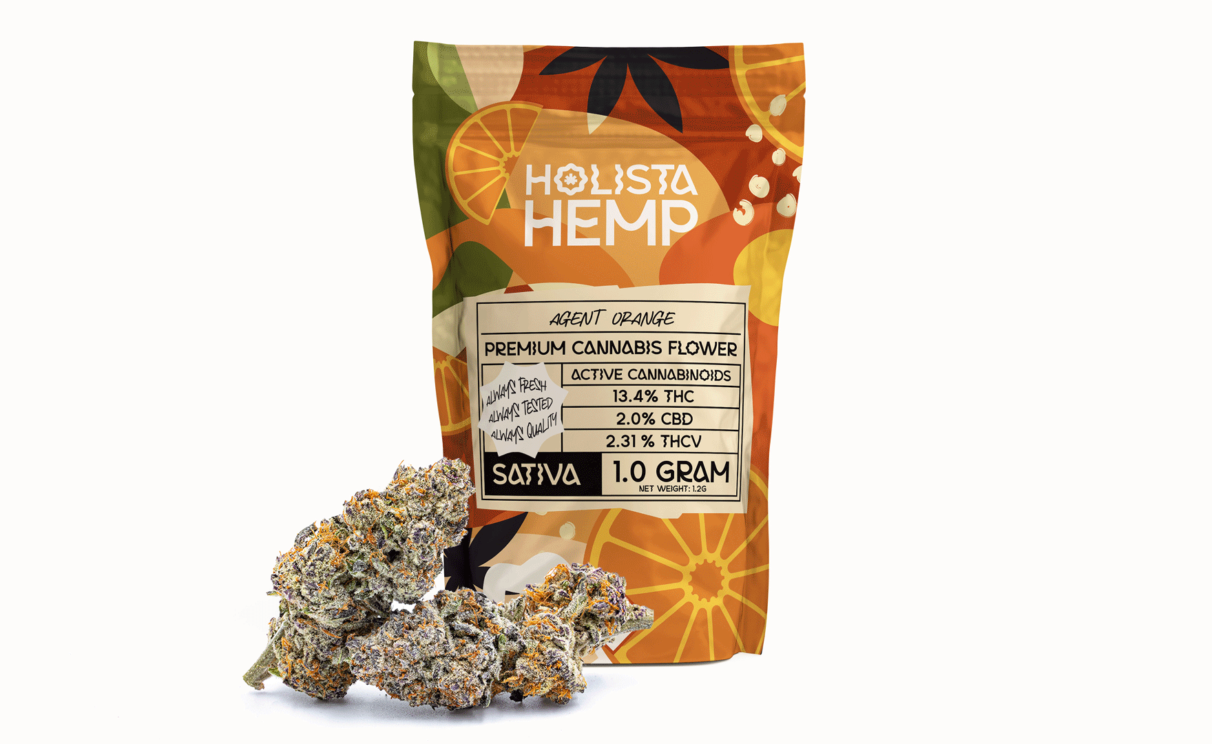
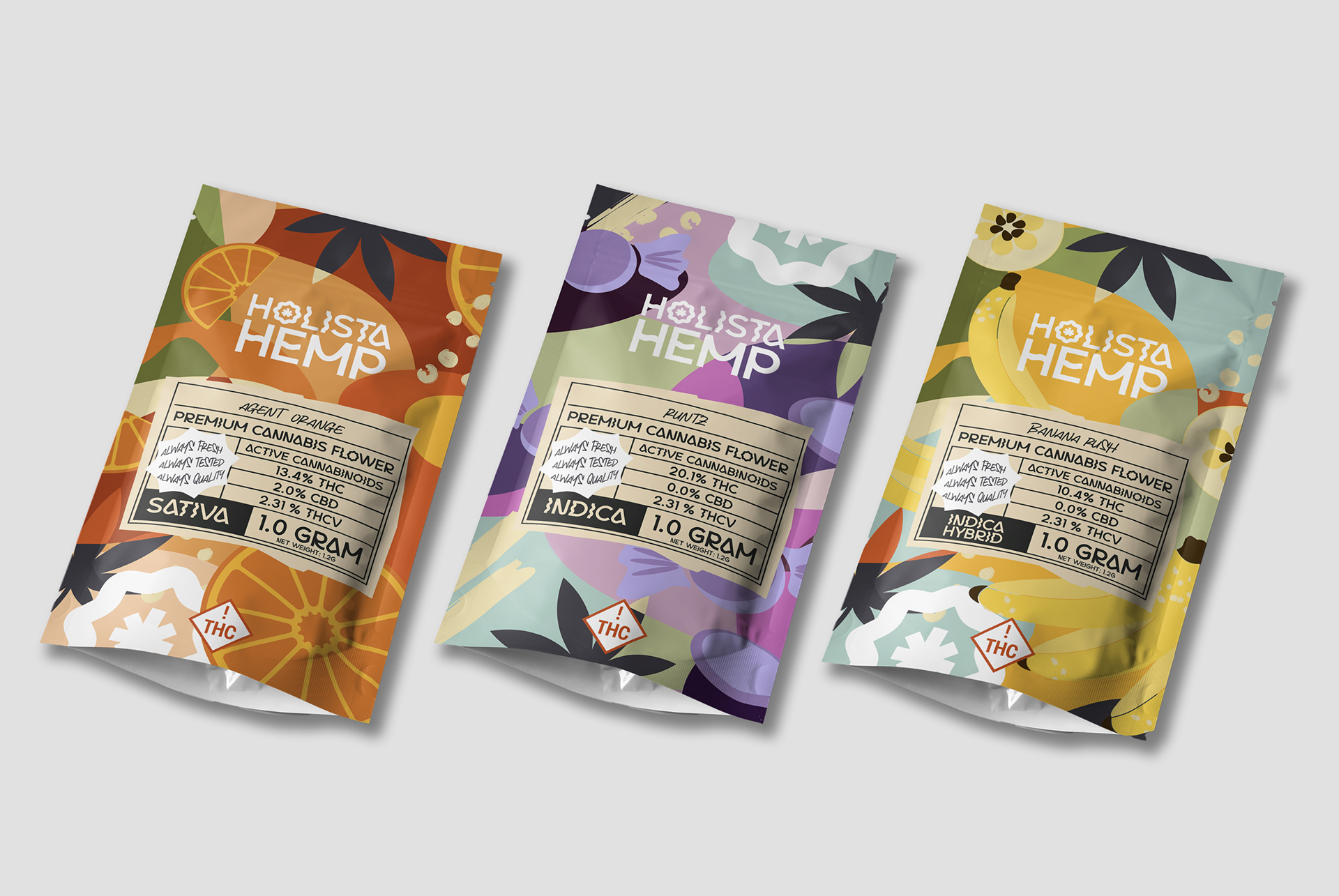
HolistaHemp is a value brand with a line of CBD-derived products, including carts, tinctures, flower, edibles, and more. HolistaHemp is perfect for wholesale and e-commerce and is designed to be affordable and approachable.
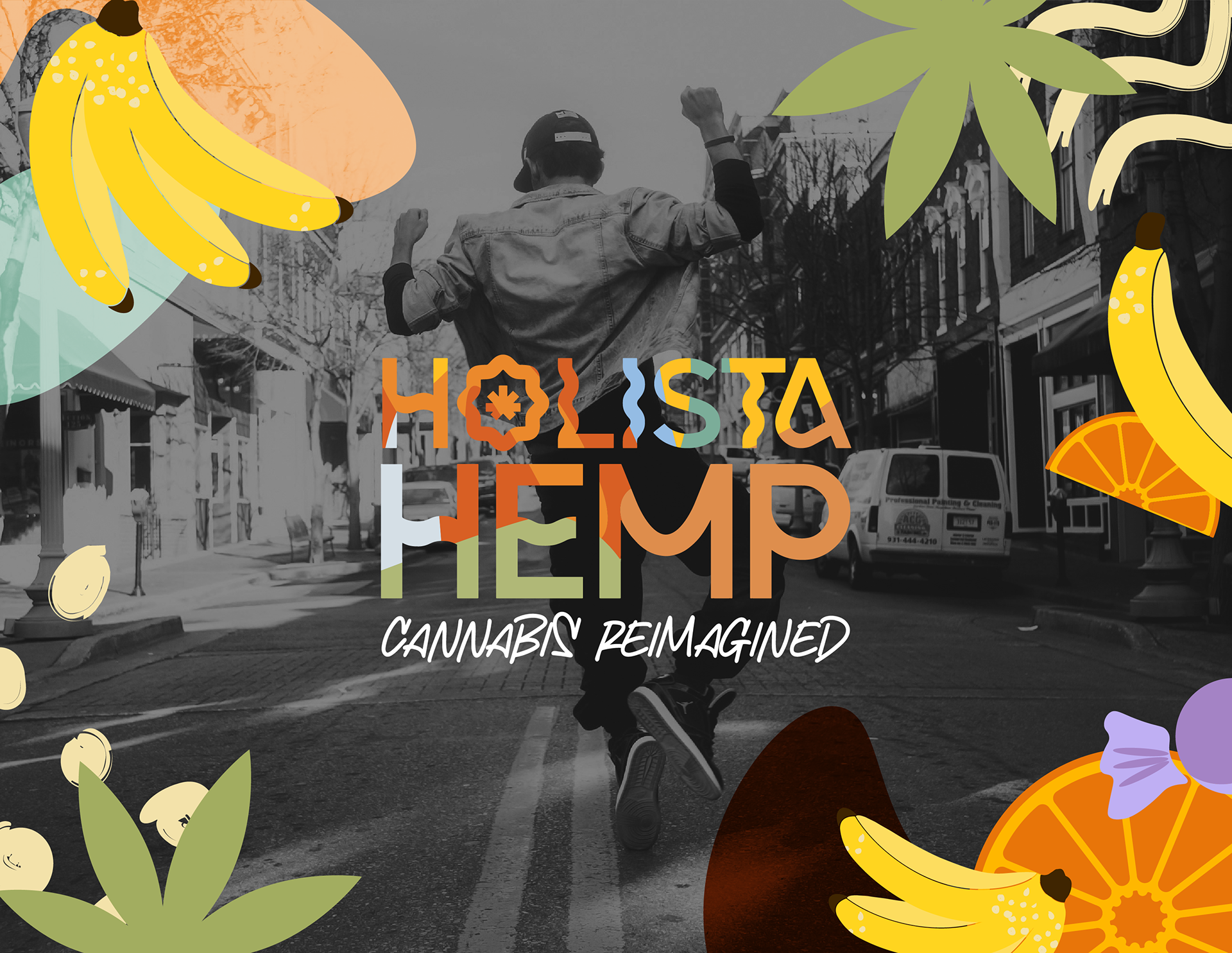
The rebranding approach centered around crafting a brand identity that was inclusive, friendly, and communicated in a playful manner. HolistaHemp's rapid expansion called for a departure from its existing brand, which had a strong association with a specific geographic location. Additionally, the client wanted a more universal appeal to capture a broader market. The existing brand's rigid and edgy feel no longer aligned with the brand's goals and desired positioning. The challenge was to create a rebrand that had an organic and approachable feel without veering into clichéd territory.
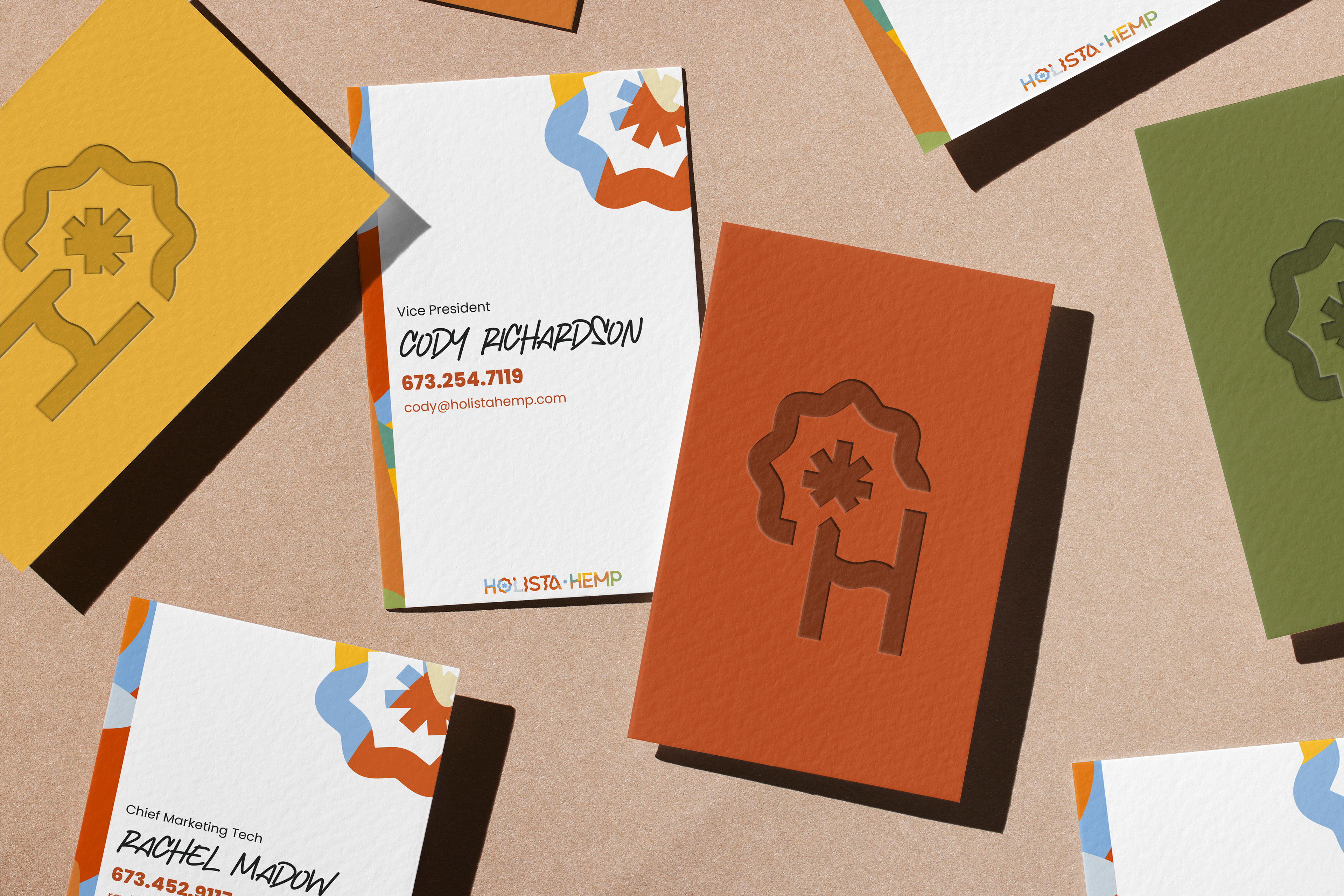
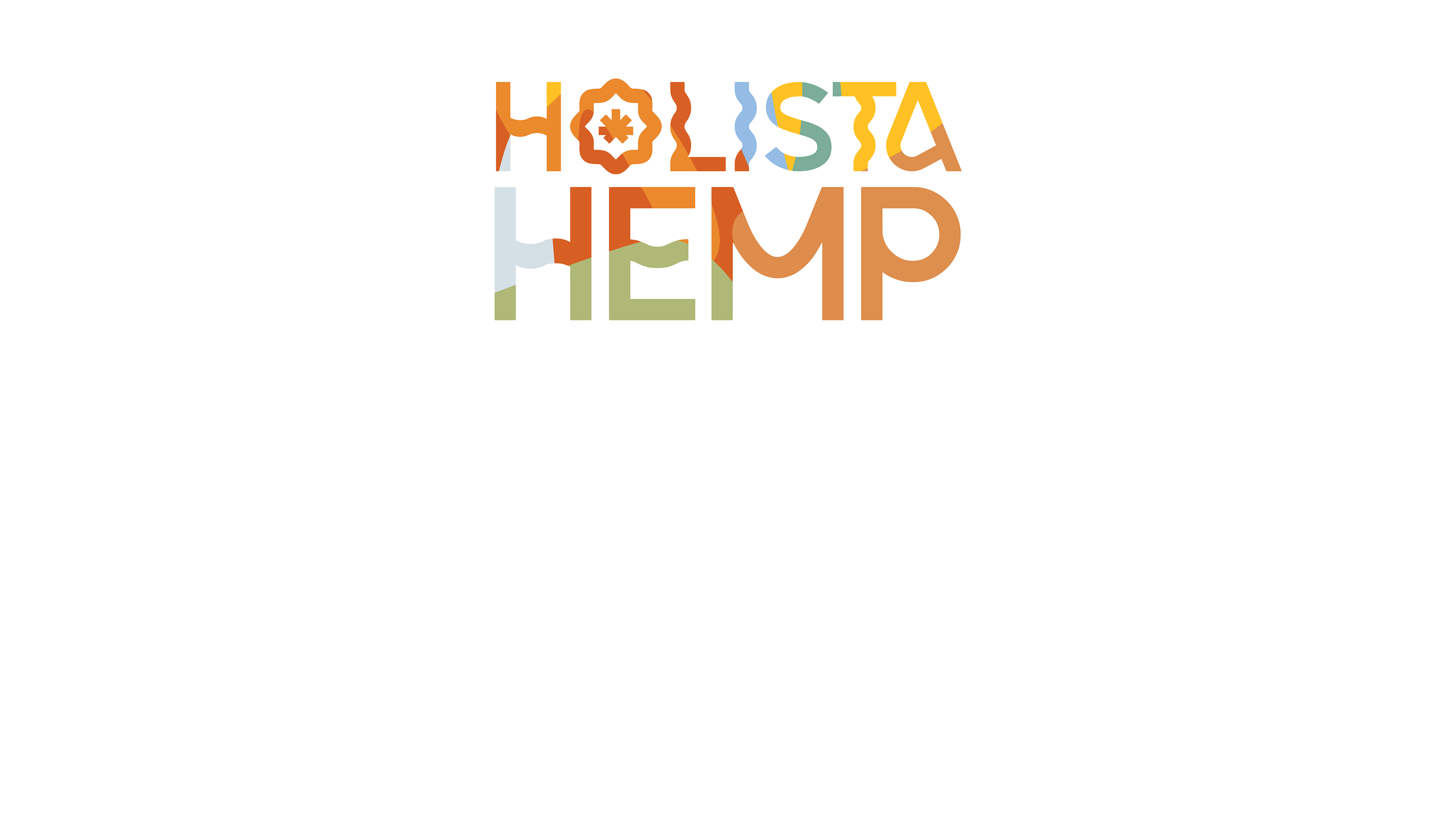
There were many things I liked about the old mark that I wanted to carry over to the final design. I loved the imagery of the sun and combining that with a hemp flower served as the foundation for the rest of the design. The new brand identity embraced a loud and colorful aesthetic that would easily stand out on retail shelves. The wordmark, while feeling slightly psychedelic, retained readability, ensuring clear communication of the brand's name.
Business in the front, party in the back.

Due to the necessity for the brand to translate to many different packaging types and flavors, the color palette became an essential tool in conveying the brand's playful and inviting personality. Bright colors were carefully selected to evoke a sense of energy and positivity, reminiscent of organic snacks found in Whole Foods aisles. The combination of vibrant hues added visual interest while aligning with the brand's goal of being inoffensive and welcoming.
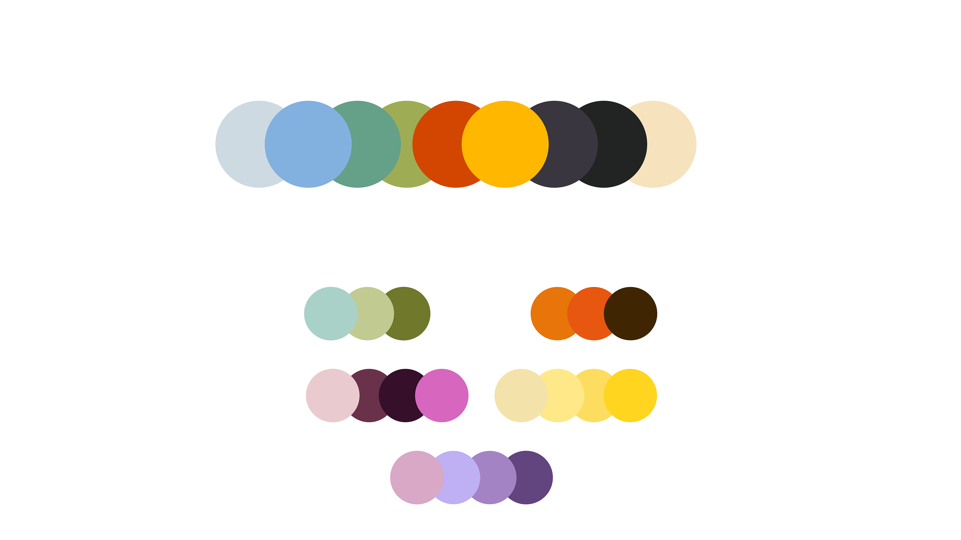
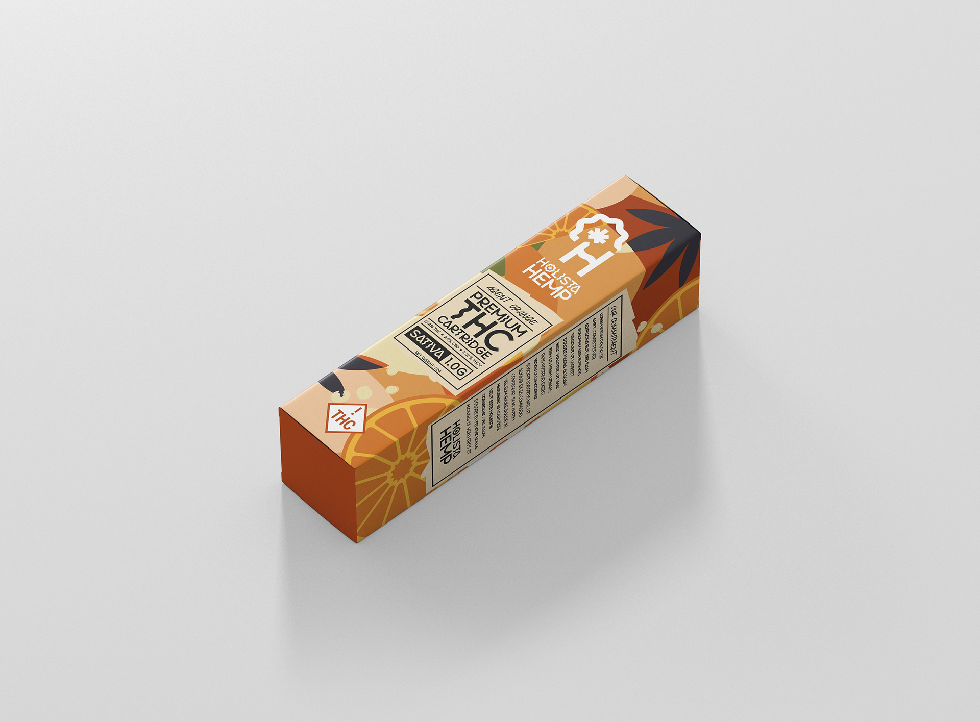
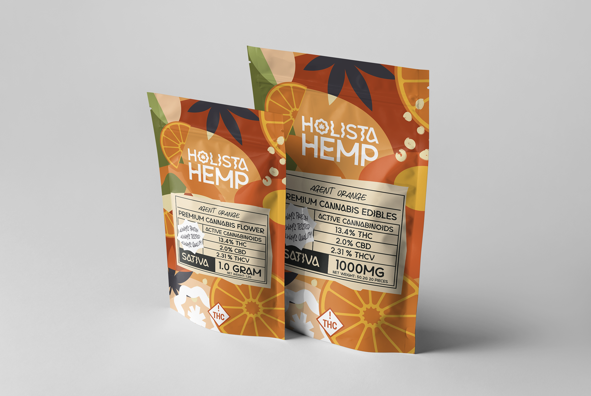
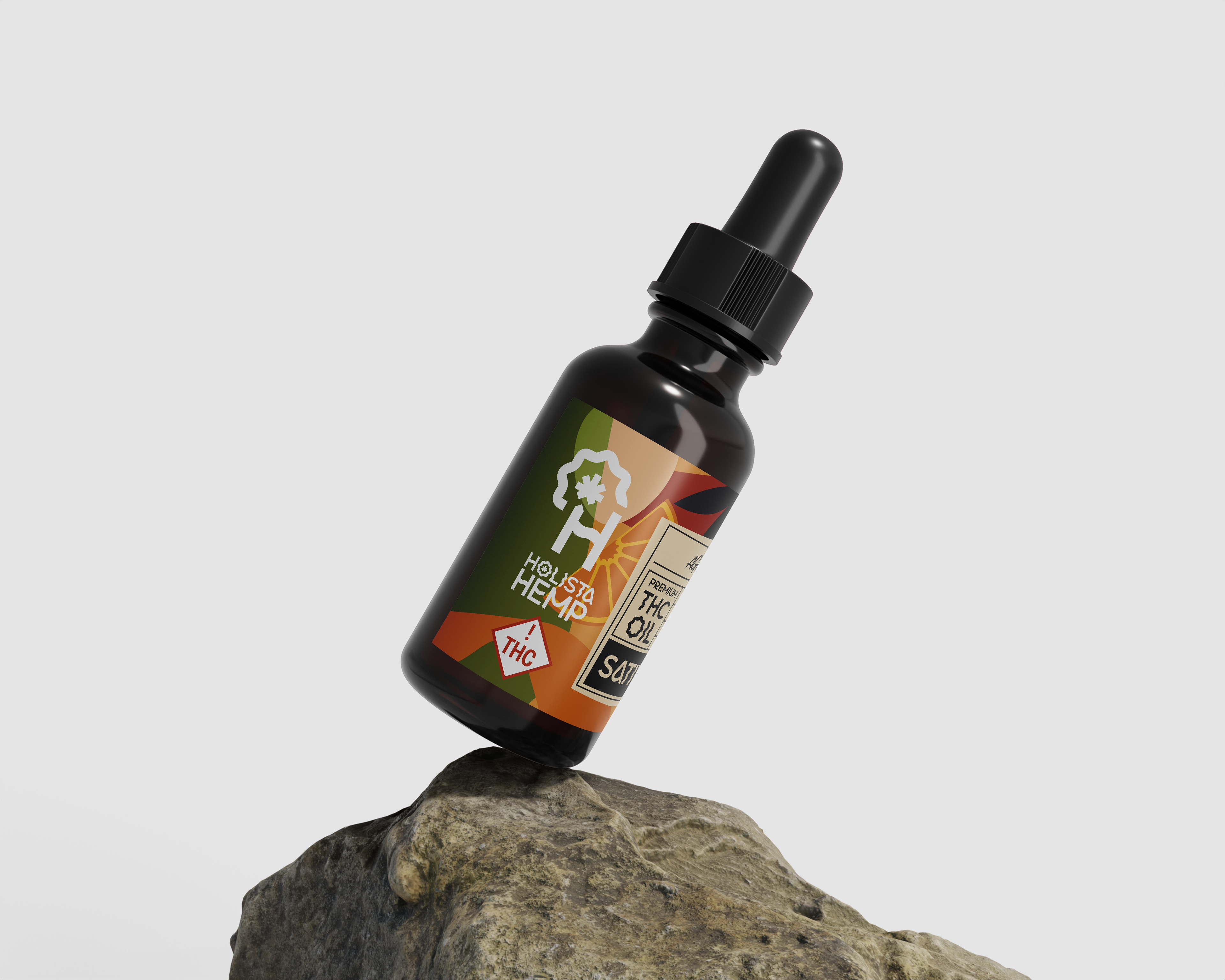
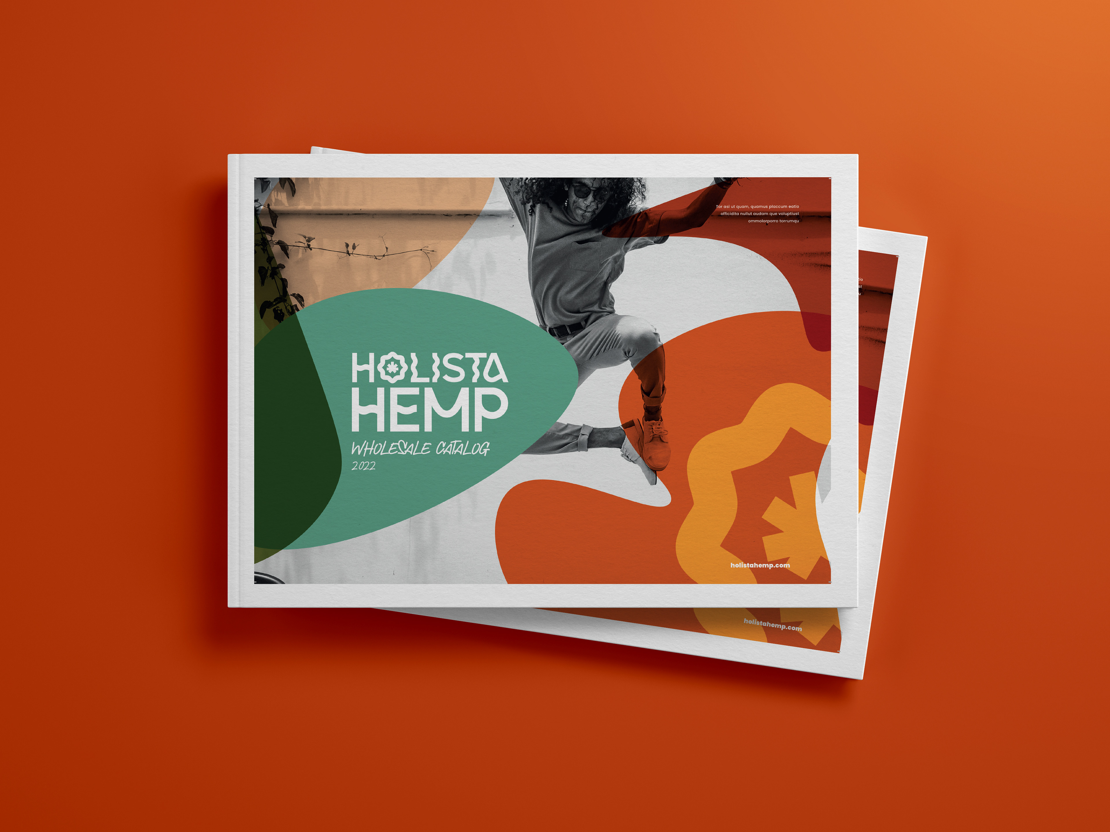
By exploring a larger, more dynamic color palette, I was able to successfully take on the challenge of creating a recognizable and familiar brand language through a large range of designs. Giving individual personalities to different product lines was incredibly important to the client. To remedy this I illustrated custom flavor profiles that then dictated color pallet alterations.
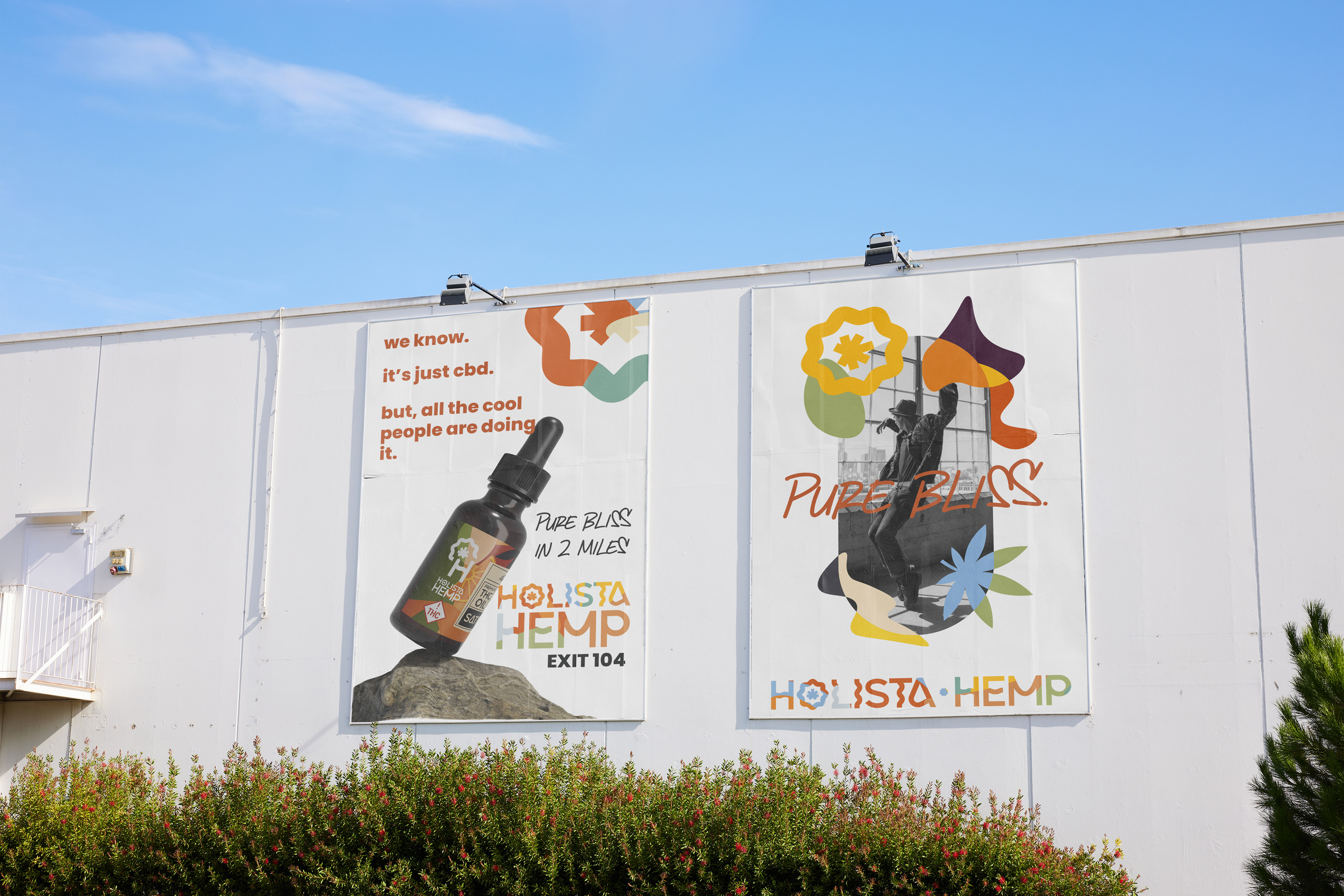
Through print and out-of-home advertising, the brand's visual identity extended beyond the digital realm, fostering a multi-dimensional presence in the lives of potential customers. The vibrant colors, soft edges, and playful graphics translated seamlessly to these mediums, effectively conveying the brand's inclusive and friendly nature. The consistent design language aids in brand exposure and further solidifies its position as an accessible and affordable CBD brand that you want to trust.